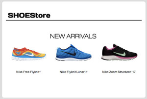
Image Swap for Email Revisited [non-mobile]
In 3 Steps to Create an Interactive Email Using CSS we saw how we can implement a simple rollover or image swap effect in email. After further experimentation I’ve found a slightly simpler method to implement the same effect.
Update: Here’s a tool to create this example: Rollover Image Builder for Email.
Update 2: Looks like Gmail doesn’t support visibility: hidden, so back to the original technique.
Toggling the visibility style
The original method involved setting the dimension on the link that wraps the image and then changing the height of the image to 0px when the user hovers over the link to reveal the alternate image.
Original CSS:
(with the added media query covered in a later article to disable on interactivity mobile)
<style>
.img-swap {
  display: block;
  width: 240px;
  height: 170px;
}
.img-swap:hover img {
  height: 0px;
}
 @media only screen and (max-device-width: 1024px)  {
  .img-swap:hover img{
    height:170px;
  }
}
</style>
The simpler method is simply to set the visibility of the image to hidden.
The updated CSS:
<style>
 .img-swap:hover img{
    visibility: hidden;
  }
  @media only screen and (max-device-width: 1024px)  {
    .img-swap[class=img-swap]:hover img{
      visibility: visible;
    }
  }
</style>
Takeaway
With this updated code, not only is the code simpler, you can now use the same CSS class for images of different heights and widths within the same email!
