Nest’s Email Carousels
Recently Google’s Nest sent not one, not two but three(!) interactive emails containing image carousels to announce their new products – a new web cam, an updated smoke alarm and mobile apps. The designers Jonathan Chinchilla (@creativechinch) and Eric Lepetit (@ericlepetitsf) kindly shared their designs with me after I inquired about the emails.

Responsive Carousel
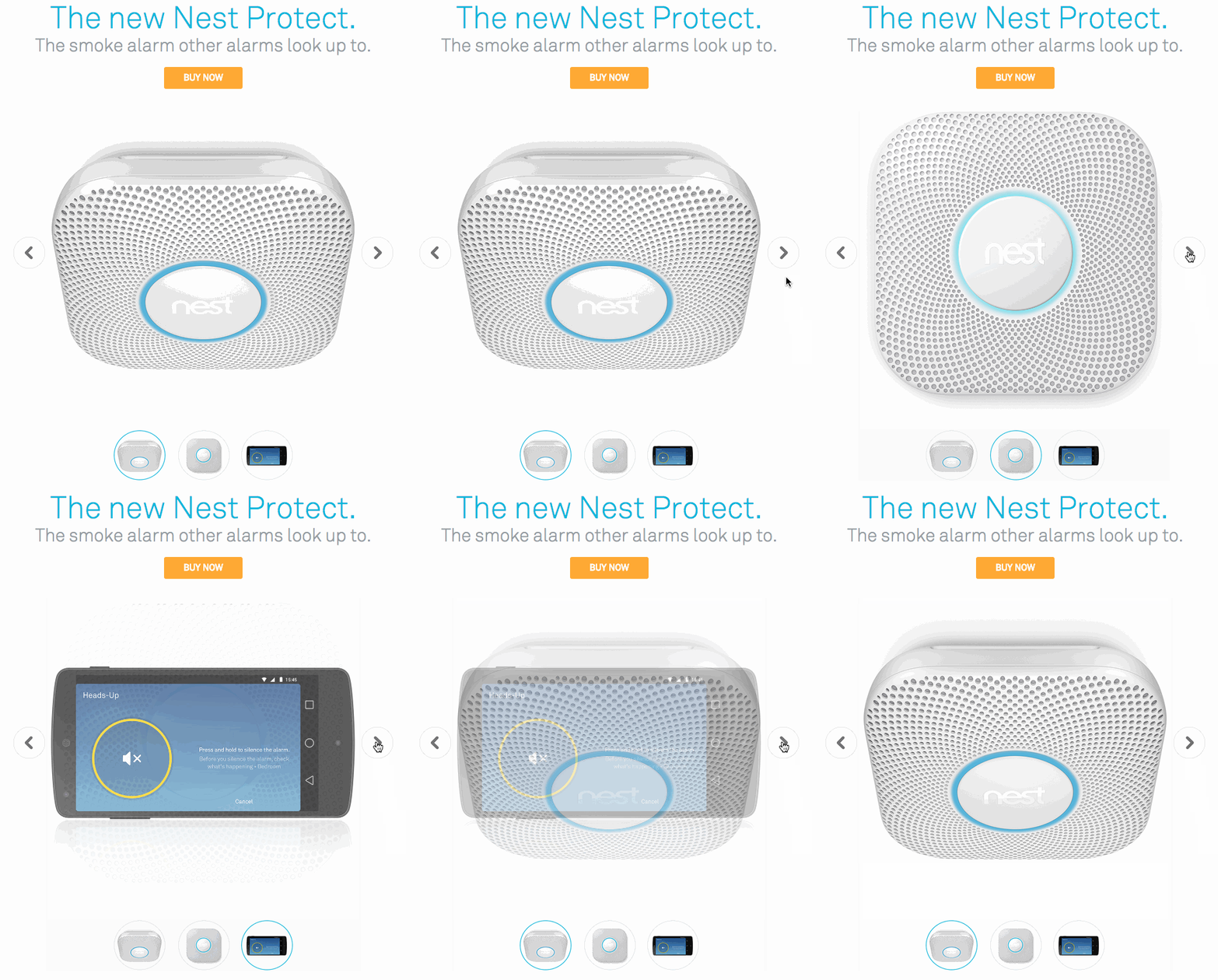
I thought the email was well designed with a clean and simple look. The Nest Protect version was particularly interesting to me as it included a responsive carousel!
In the widest configuration, the left and right navigation arrows are present, but when scaled to a mobile device, the arrows disappear, leaving the thumbnails at the bottom as navigation options. When viewed in a non-supported client (ie. Webmail), the carousel falls back to a rotating animated gif.
Eric told me that they experimented with many different versions of the carousel including one that supported Webmail as well – but ultimately felt that this version provided the best user experience.
Check the emails out:
I’m really glad to see more and more emails taking advantage of the advanced capabilities of the modern email clients. If you come across any cool interactive emails feel free to reach out to me at @freshinbox.
This is an incredibly impressive email – so slick! And the design is so clean and clear. Well thought out and well implemented bit of progressive enhancement here.
This is cool but it doesn’t work/appear in outlook.com or office 365.