Pret’s Kinetic Email Case Study on Campaign Monitor
Note: This campaign was created before iOS9 which require a special fix to get sibling selectors working.
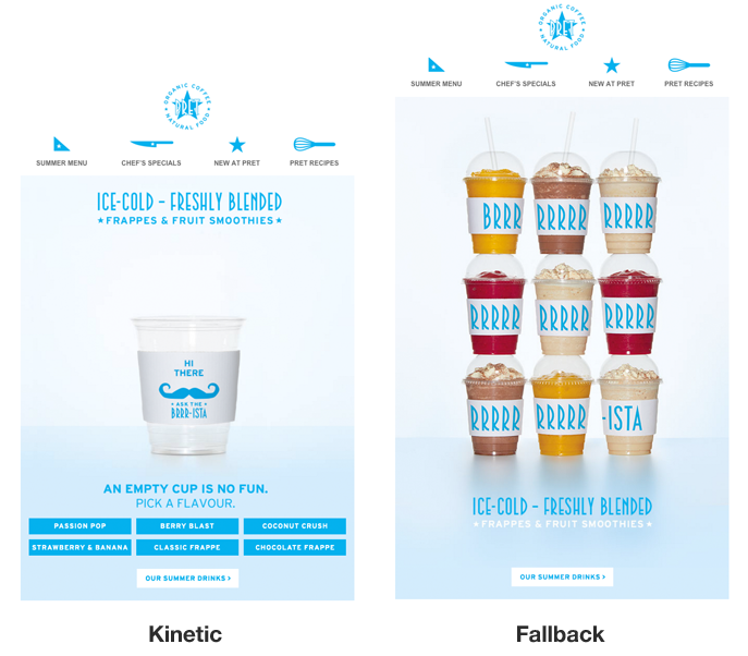
Check out this case study of a kinetic campaign featuring an interactive smoothie cup the digital agency bigdog created for Pret, a British sandwich retail chain featuring their line of smoothies.
(Requires a modification to work in iOS9)
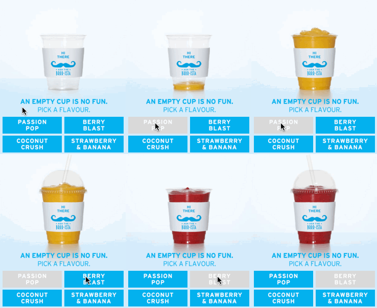
The kinetic version featured an empty cup and the recipient could watch the cup fill up by selecting from six different flavors. The fallback version featured a stack of smoothies with the cup jackets spelling BRRRRRRRRRRRISTA which I thought was neat.
I really like this email for a few reasons. I found the smoothie carousel brought with it a sense of fun and delight when the recipient selected an option and watched the smoothe cup fill itself. I also felt that a lot of thought was put into the fallback design so that recipients who weren’t able to see the carousel got to see something cool as well!
The word “wonky” in the view in browser text played into the fun aspect of the campaign.


This does not work on the iPhone???????
iOS9 introduced a general sibling selector bug that made it fail in the newer iPhones. Here’s the fix.