Interactive Carousels in Email: HP ENVY & B&Q Outdoor Furniture
This week we were treated to not one but TWO campaigns featuring image carousels and I’m especially excited about both of these campaigns for reasons I’ll explain below.
HP ENVY All-in-One PC Carousel
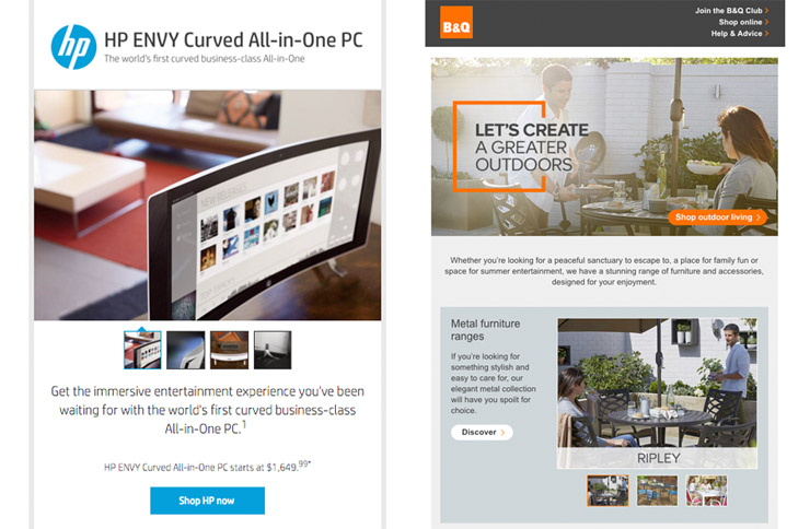
HP sent an email containing an image carousel that featured their curved all-in-one PC. Eric Lepetit of Nest noticed that the carousel was developed by RebelMail which is famous for their in-email shopping cart solution.
What’s cool about this campaign is that unlike a lot of other kinetic campaigns, this one worked in Webmail(Yahoo! Mail & Gmail) as well – which means a lot more recipients were able to enjoy the interactive experience.
The carousel also leverages animation and transitions when viewed in a more capable client such as the iPhone where the carousel would cycle through the images automatically.
For Outlook and the Gmail app, the carousel falls back to a single static image without the thumbnails.
B&Q Outdoor Furniture Carousel
(Use a webkit browser like Chrome or Safari)
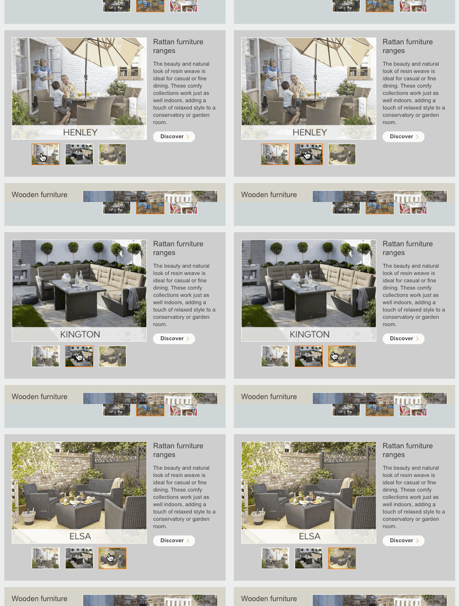
I’m very excited about this B&Q campaign featuring an image carousel of their outdoor furniture because Nick from from Wax Media, the developer of the email, reached out to me when developing this email letting me know that they got their inspiration from my email carousel tool!
They added their own enhancements to the carousel such as having the thumbnails appear larger in mobile, using separate thumbnails and images in the carousel and incorporating an animated gif as fallback.
Come across any cool kinetic campaigns?
Like I said at the start, I’m really psyched that more campaigns are incorporating interactive elements and if you come across a cool email that uses these tricks, let me know!


I got a really nice one from the telegraph on monday (web link below)
click here
Pretty neat. I like how the product changes but the background remains the same.
Hi @sidney, your link doesn’t work; do you have an updated one? Thanks.
looks like the weblinks expired for that mailer. I should have screen shot it :(
Looks like the B&Q campaign was changed. The source code uses animated gif rather than carousel.
The code was written to only display in Webkit clients. So use a browser like Chrome or Safari to see the carousel.
I’d love for you to make the same enhancements to your carrousel tool that HP and B&Q made. Do you think you’ll be doing it? Love your articles and page. I’m a home email coder.
Hi Justin,
Have you thought about adding an exception for Yahoo to hide the radio buttons.
Since Yahoo Mail now strips display:none inline, we have to add it to the head as I’m sure you are aware. Might be useful to have this in the tool.
Doesn’t work in gmail anymore, right?
Yeah unfortunately. Though you can still do :hover based interactions like rollover images.