Burberry’s Interactive Scarf Personalizer Email
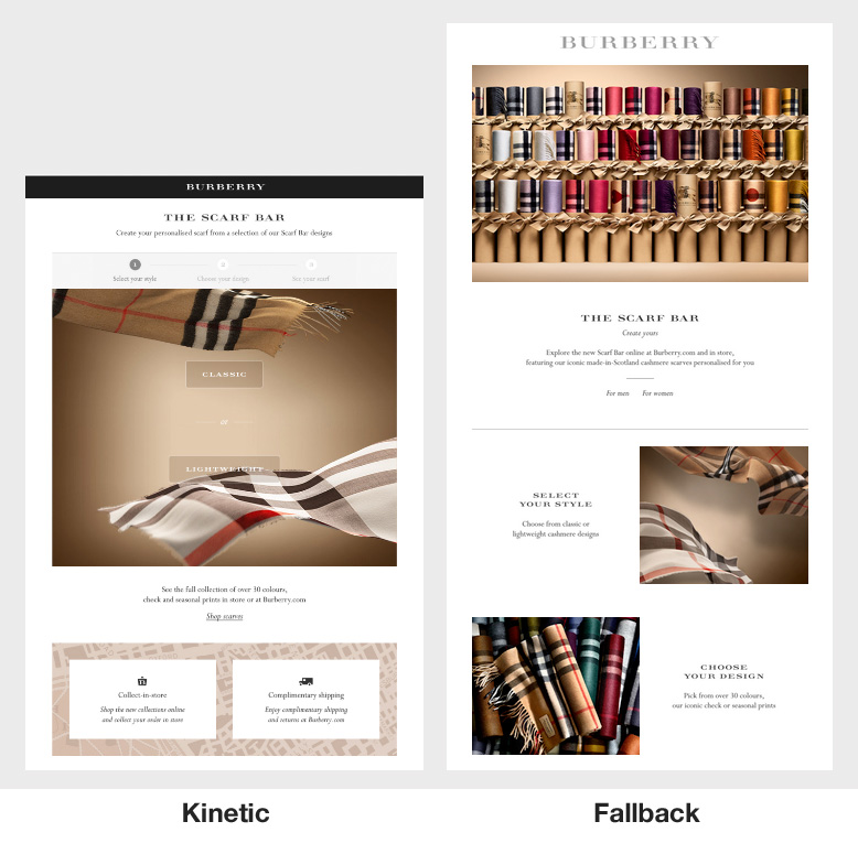
Burberry sent a really slick kinetic email campaign featuring a 3 step interactive scarf personalizer. The email allowed recipients viewing the email on a webkit based email client the ability to select a scarf and then view a preview of the scarf with the recipient’s initials monogrammed on the scarf.
Needless to say, I was blown away. This was by far the most sophisticated interactive email I’ve come across so far.
Step 1: Selecting the scarf type

The initial screen displays a 3 step progress bar at the top giving a strong hint to the recipient that this email may be “more than meets the eye”.
Under the progress bar features two animated scarfs with a “Classic” and Lightweight” button above each of them. What’s interesting is that the animated scarfs consists of 20 frames within a single jpeg “sprite sheet” and the animation involves sequentially shifting the frames within view using the background-position style. The mobile sheet was 275KB and the desktop version was 517KB – the file sizes are probably smaller than equivalent animated gifs with higher color fidelity to boot!
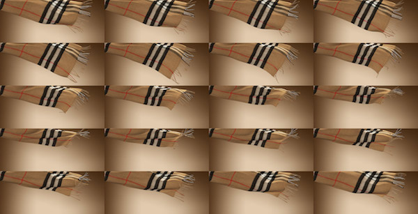
Here’s an interesting article explaining sprite sheet animation using the steps() function.
Step 2: Selecting the scarf pattern
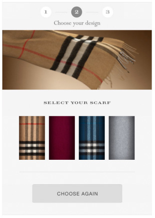
This screen displays an animated scarf chosen on the previous step. The recipient can then select a pattern. The user can return to the previous screen by clicking on the progress bar or the “Choose Again” button.
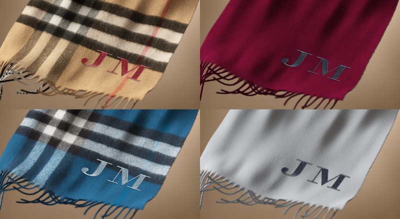
Step 3: Viewing the monogrammed scarf
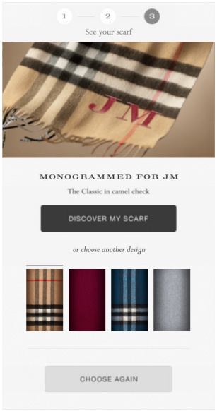
At this step the recipient is given another surprise. The recipient’s initials are shown monogrammed into the selected scarf! The recipient can then click over to the Burberry website to purchase the scarf.
The technology behind the monogram is done using Adobe’s Scene 7. Personalized or “on demand imagery” have been around for a while, but whats so cool about this example is just how realistic the monogram looks.
Try it yourself by visiting this link and changing the last two letters at the end of the URL.
Kinetic campaign of the year?
I have to say I’ve come across quite a few impressive campaigns that integrate interactivity and CSS animations but this email takes the cake for sheer technical execution.
Thanks to Jim Maddock for sharing the example!
Did not realise gifs weren’t used in this campaign – that is impressive! Overall thought this campaign was really nicely done, but if I were to nitpick, I just wish their interactive elements looked more like they were meant to be interacted with. When I first saw the email, the main action points blended in with everything else.
Really nice looking email and definitely a good first attempt, but it does seem to have a few problems.
It doesn’t have the fix in place for rendering with the old Webkit bug that came from early webkit days. This effects android (not so much in this email) and has recently cropped up with iOS9 so it isn’t rendering correctly on iOS9 mobile devices.
The file size is 166kb as just HTML so not taking Images into account which has caused gmail to crop the email.
Pretty and as I said amazing first attempt but a lot of things that need cleaning up. Some rather old email HTML techniques in there that are pretty outdated now that could be removed to save some space.
Interesting points. Are you referring to the general sibling selector (~) bug? I noticed there were two instances where ~ was used although I found that the email still worked on my iPhone 6 which is on iOS9.
It’s mainly due to the complexity of the media queries, they are slightly too targeted for their own good I think, the iPhone six appears fine because of it’s screen resolution. iOS 9 on iPhone 5 range seems to not mobile optimize the whole email leaving the interactive area to be tiny. Essentially, like the sibling selector “bug” on old webkit you will also see a few more quirks brought over. The way media queries are handled is one of them.
It’s best to keep media queries as tight and exact as possible:
@media only screen and (max-width: 640px) and (-webkit-min-device-pixel-ratio: 1), only screen and (max-width: 640px) and (-moz-images-in-menus:0){…}
This would have achieved the exact same as their huge list of device widths, as you could just 100% the width and center contents. This may or may not render the “kinetic” version on AOL chrome though, depend on how you have setup your headers.
Also just FYI you don’t always need that sibling selector fix you mentioned above, having something animated with keyframes is usually enough. The fix is a catch all.
Thanks for the technical insights! Interesting to know that the animated bugfix isn’t required per-se for the sibling selector and its there as a catch-all.