Gmail iOS App Increases Email Font Size and What You Can Do About It
UPDATE 8/31/2016: The fix for issue has been updated.
For the Gmail Android issue, use a spacer image with min-width.
Late yesterday Brad form MixMax noticed that the Gmail iOS app added a notice at the top of some emails that seemed to suggest that Gmail has started to support Media Queries
However on further inspection it appears that the Gmail app on the iPhone and iPad are merely increasing the font size in some emails.
For the most part, this change has improved the experience on Gmail as it has made previously small fonts legible. However in other emails it has made the experience much worse, primarily by causing lines to wrap and breaking designs.
Gmail really should just bite the bullet and support media queries just like the iOS and Android email clients. That way, designers can decide on the best font size for viewers on mobile and desktop clients.
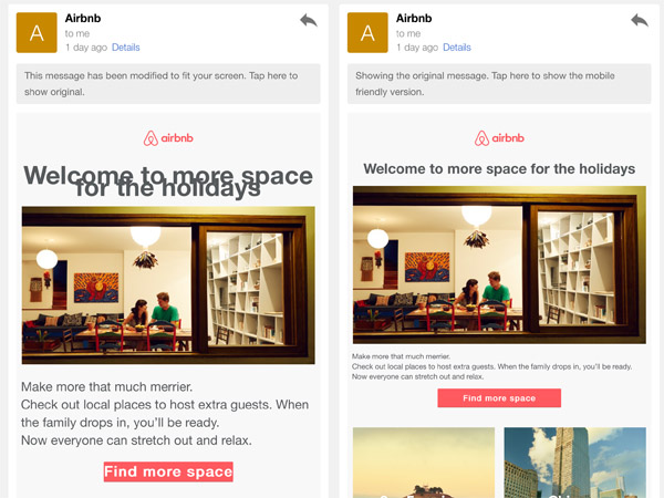

Font size increased by over 50%
It appears that the only change is the font size. However from my crude measurements it looks like Gmail increases all font sizes by over 50% which is significant and causes many lines to wrap. This is both for fonts set in px as well as em.
Screen Width Dependency
I also noticed that not all emails are modified, in fact quite a number of emails such as those from Brookstone and Target were left alone, with tiny text and all.
I came to the conclusion that gmail applies this change to emails containing any element that is wider than the current viewing window size. For example when viewed in potrait mode on an iPhone 6 Plus, emails with tables wider than 400px triggers the font size change, but when viewed in landscape mode, the email is not modified until the table width is over 700px. Similarly on the iPad the modifications are triggered at approximately 625px in potrait mode.
Try out the Image Carousel for Email Tool.
A Quick Fix
However I noticed some emails such Brookstone were 640px wide yet did not trigger Gmail’s font size changes. After more sleuthing, I found out that if the white-space: nowrap style is applied to text and if increasing the text size would cause the email width to be widened beyond the window width (causing the email to look really bad), that Gmail somehow senses it and backs off on applying the font size change.
After some experimentation I came up with a snippet of code that would prevent Gmail from applying the font size change to your email. If Gmail’s font size change causes your email to look particularly broken, you might want to try putting this code at the bottom of your email above the closing body tag to prevent the font size changes until you get a chance to make design changes.
UPDATE 8/31/2016: The following fix no longer works see the updated fix here.
<div style="display:none; white-space:nowrap; font:15px courier; color:#ffffff;">
- - - - - - - - - - - - - - - - - - - - - - - - - - - - - - - - -
</div>
If your email is 700px or wider, add 5 or 6 more dashes and spaces to prevent Gmail from bumping the fonts on the iPad. If you have a long email, you might consider putting this snippet closer to the top and adding line-height:0px so it minimizes the vertical whitespace.
Update May 8 2015:
Alex Williams (@alexcwilliams) discovered that Google (of all companies) uses a similar snippet but uses non-breaking space ( ) instead of ‘-‘ for their Analytics newsletter, which is an improvement from the one above since it doesn’t require you to mess with font colors:
<div style="display:none; white-space:nowrap; font:15px courier; line-height:0;"> </div>
Explanation:
- The white-space:nowrap with the dashed line creates a line about 500px across that when bumped up in size will exceed 700px causing the Gmail app to not apply the font change.
- The display:none style causes non-Gmail clients to hide the block (Gmail ignores display:none). When the email is viewed in say, a non-Gmail mobile client, it won’t affect your responsive layout.
- The font is set to white so the dashes are not displayed when viewed in Gmail. If you have a different color background, set it to your background color.
As always, after making any changes, test! :)
Your fix works perfectly, but I’m noticing that it’s causing issues with the way emails are rendering on iPhone 5S (iOS 8). At least, it appears that way according to EmailonAcid. From a few emails that I tested, the creative is showing up blank on iPhone 5S (iOS 8). I don’t have an actual iPhone 5S to test on, so I don’t know if this is just an issue with EmailonAcid’s rendering results. Have you seen the same thing?
Hey Bruce, I don’t see an iOS8 option for iPhone 5S on EmailOnAcid (they only have iOS7). My tests shows up fine on iPhone 5S on iOS7.
Not sure why you’re not seeing it, but here’s a screenshot of the iPhone 5S (iOS8) rendering in EmailonAcid – https://www.evernote.com/shard/s466/sh/022bd8d4-a5f3-41c3-ae24-4e4cbf88e3ed/2105c8679709b9b09a65deb5b5ebcc99
iPhone 5S (iOS7) and iPhone 6 (iOS8) both look fine. This is the only one that seems to be giving me issues.
I reran the test and the rendering showed up. The first one must have just been a hiccup with EOA
Thanks for this! Have you tried line-height to see if it fixes the “layered” effect on multi-lined text?
AJ, if you’re referring to the Airbnb email, I think it just wasn’t designed for the text to wrap. If they had known Gmail would cause it to wrap, I’m sure they’d have adjusted the line-height and it would have fixed it.
Hi Justin, thanks for posting this fix – the app update has caused quite a few headaches this week.
We’re still having a few problems using this fix though. When we add it to the bottom of some of our longer emails the Gmail app is initially cutting it off (with the option to “view entire message” to show the whole email) and when we add it in closer to the top of the email we’re getting 15px of whitespace showing.
Any thoughts on a way around this?
Hi Nick, adding line-height:0px should address the whitespace. Let me know if that works for you.
The DIV style snippet is brilliant. It totally fixed my 660px templates and saved me a day of recoding work.
Thanks this fixes the issue. However white text on white background may trigger spam filters. Thanks for the quick fix though :)
How about using
instead of the dashes to avoid the potential spam issues?Vic I checked with my colleagues and the white on white may increase your spam score but if you have decent reputation it shouldn’t make a difference – but its something to consider!
Mark, hmm yes
may actually be better! Unfortunately (fortunately?) I can’t test it as Gmail rolled back the changes!Mark, I tried with first thing after I saw this article. It didn’t work for whatever reason. Glad they reversed the updates.
I like this fix, but i think that should be a serious issue, because Google punishes websites if they use the same color and background-color and try to hide content from the eyes of the user. Also thats why Gmail ignores display:none, to disable the opportunity to hide something from the recipient. These are the facts, and the rest is only hipotetically, but after this i’m not sure, that the fix can avoid spam filters in 100% ….
Thanks a lot. I have wasted a couple of days finding solution to the font auto resizing for android gmail app. After reading your article, it fixed my problem in no time.
Many thanks for this fix!
Thank you for this very helpful piece of information!
Hello,
I have the same problem I simply added !important to font size definition, for example:
Content
It must be added to all tags, so when in this will be <span> or <a> you need to add !important to that font size.
I’ve check it on E-Mail On Acid and everything work fine.
Maybe it will help someone!
Cheers!
Here’s a fix that works, and avoids the need to hide content, which might trigger a SPAM flag.
A. Add an !important declaration to all of your font sizes and line heights.
B. Add an Outlook conditional comment that includes the same rule sets you applied the !important declaration to, minus the declaration.
Example:
h1 {
font-size: 20px !important;
line-height: 26px!important;
}
h1 {
font-size: 20px ;
line-height: 26px;
}
That’s general idea. Did a full test on Litmus and every client looks good, including iPhone/Gmail.
Eh, the 2nd rule set in my comment is supposed to be inside a MSO conditional comment, but it was stripped.
Thank you Thomas, some folks also suggested this in the Campaign Monitor forum:
https://www.campaignmonitor.com/blog/post/4377/gmail-larger-font-sizes-no-responsive-support
If you don’t have a lot of font declarations or media query overrides, this suggestion would definitely come in handy. As for the spam concerns, these days ISPs are using much more sophisticated techniques to identify spam than simply color on text but as I mentioned in the post, nothing beats testing yourself :)
Nice it works!
Hi guys, I tried to apply the latest fix (the one suggested Alex Williams) on a fluid-responsive email..and it causes the reverse of the email to scalable layout (in Gmail app for Android). In other words, tables that should stack remain on the same row, totally dismissing the fluid layout. Anyone having the same problem?
Unfortunately this technique is not a panacea. This technique forces the width of the email to around 500px and therefore the fluid layout won’t work with this. We’re between a rock and a hard place. Know anyone at Gmail? :)
Thanks Justin you have solve my biggest problem.
I have one question how much non-breaking space ( ) or ‘-’ for 624px width email. ‘Coz if i added your given amount of non-breaking space its extend width but when i remove 3-4 its fit.
Secondly non-breaking space ( ) or ‘-’ = ???Px (approx)
Hey Mukul, you’ll just have to test combinations of monospace fonts and the number of characters to suit your needs. Just create a div in a local HTML file, set it to the width you desire and fill in the characters until it fits :)
Hey Justin,
I put in the initial fix with the dashes and I’m finding that it is working well in the Gmail app for iPhone but not in Android where the auto-fit is switched on. I’m testing on the Samsung Galaxy s6. The design of the email is two columns (nightmare!) and the right hand side is getting ‘squashed’ . Do you have a solution for Android auto-fit?
Lindsay, have you tried the min-width hack?
https://litmus.com/community/code/274-force-gmail-app-to-render-desktop-version
I have had a go at using min-width and it didn’t work unfortunately.
I’ll try again and see if it works a second time.
Android 4.4.4 Email app has problems with 2 column responsive layouts (with my email template, it doesn’t throw tds into their own row so they squash up). Either go one column or keep your columns 50% width each. Not perfect but makes it more readable.
Here’s a question. What could cause this?
We have created a newsletter that works perfect (as far as can get) in IOS, Android and desktop. Here’s the problem. The company that we built this newsletter for, sent us screenshots showing us that the responsive content is showing but also the NON responsive content that should be hidden.
Now, i have tried EVERYTHING here to reproduce that problem, however, no luck. it works perfect here.
The client’s phone is android and is in Germany, we on the other hand are based in the Netherlands. Does anybody know what causes this? Is it a setting on her phone? language setting or something else perhaps? I have tested and tested it on a large amount of android phones but no problems here. Only on her phone. (explains why i am thinking of settings or something?)
kind regards,
Boyke ten Broeke
@Boyke – Gmail doesn’t support media queries, so you cannot have two versions of an email within the same file. You need to tell your client that Gmail doesn’t support responsive emails (other than the fix here for the best results – forcing the desktop version), if she is using Gmail app on her phone then that is going to be a problem. what app is she viewing the email with?
However you should really only have one ‘truly responsive email in your file, not two which are switched via media queries depending on device. That’s how you will get the best universal support.
Just to add, I think we should forget about responsive emails for Gmail App and use this fix. Unless you want a boring 1 column email that is…no thank you!
We’re at the mercy of Gmail picking their bums while we wait for some basic media query support for their client. Argh
The people who write the gmail html parsing engine are core Google engineers. They are going to do what they feel is the **RIGHT WAY TO DO THINGS**.
The people who crafted your analytics newsletter are contractors, on a deadline, on a budget, and just trying to get something that works out on time. They have a bias towards Google products – you can probably get away with an email that looks bad on Outlook or IE if it looks good in the Gmail app and Chrome.
Core Google Engineering is not vetting every email build that goes out for conformity to Google’s view of proper email HTML.
Proper engineering would not be altering the incoming email as you could never code smart enough to have 100% of cases work well.
They should also support media queries as that is considered the correct way of supporting smaller devices. Not randomly enlarging font sizes ( and not matching line heights)
So to answer you. Google engineers do not have the simplest of understandings about design and fonts sizes. They do not even understand that line height must be changed with font size or eventually lines will sit over each other. Making the text UNREADABLE.
Hi Justin,
Thank you and thanks to Alex Williams for the genial hack and it did help us in the past! Unfortunately this hack is no more working since a few days as the Gmail (Web, iOS and Android) begun to support “display:none”. The hack will be therefore ignored and the Gmail iOS app is bumping up the text again. Any idea how we could handle this problem? Thank you.
Just came by to thank you for this post, and to add that (after much agony) I realized that I needed to add some more non-break spaces to ensure that this same fix also works in landscape mode (my email was triggering auto-sizing in landscape only). Adding five more of them did the trick!